Thoughts on A Combined Library/Dining Room…
January 25, 2013Happy, happy Home Tour Friday! If you live anywhere in the US right now (with the exception of the most Southern States), you are probably chilled to the bone.
This makes me think of hot chocolate.
And curling up with a book.
And that brings me to my next house conundrum that I’ve been thinking about for a while.
{Yes, these are the things I sit and ponder.}
The library is valuable real estate inside a home, and often it sits empty. Counting the days and weeks until Thanksgiving, and then feeling rushed through Christmas, and then all year it sits.
So I wonder if the room would get more use as a library/dining room.
Let’s look and see what we think…
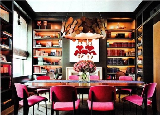
Source: Marcus Design
Okay, killer light fixture. The pink is fun, but The Running Man would ix-nay that before it left the design store. A great pop of color in an otherwise dark room though.
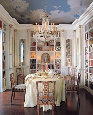
Source: Victoria Dreste Designs
Mark the ceiling for a future room – that is just incredible! Love the white of the millwork.
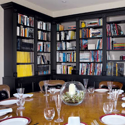
Source: Victoria Dreste Designs
This needs a fabulous light fixture and it would feel complete to me. I love, love, love round tables. (Wait, or is this oval?) I love, love, love round tables.
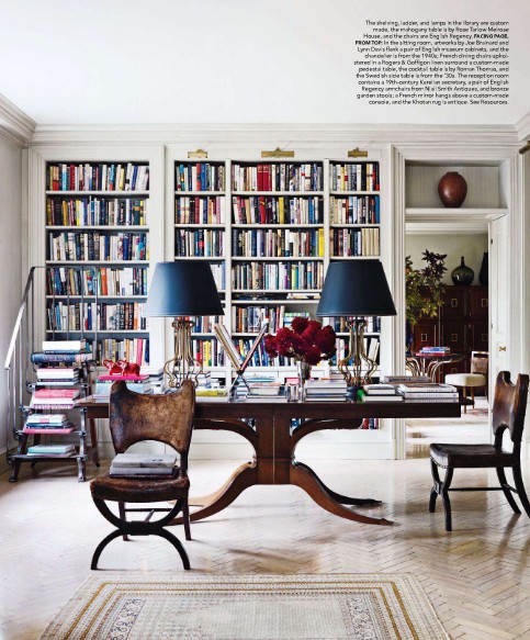
Source: Pinterest (original unknown)
This is the true embodiment of what I was thinking for most of the year: The dining room is strewn with appetizing books and puzzles to grab readers (and puzzle-doers).
Love the navy lampshades; the chairs pulled away and stacked with books.
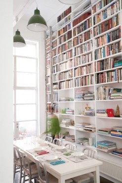
Source: MyIdealHome.com
Another light and bright, IKEA-esque cleanness to this one.
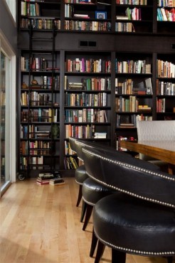
Source: Houzz.com
Standing at 5 foot 2 inches, I would be grateful for the ladder that I’m hoping can be pulled around the room. Very masculine – dark wood, heavy chairs.
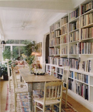
Source: Stela9.blogspot.com
Another un-fussy option. One tweak I would make is to add a 18-inch “lip” on top of the lower bookcase, to be used a serving buffet when dining or a place to pull out books and open them up.
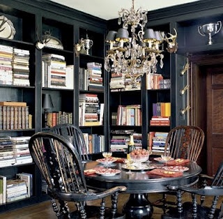
Source: Booklicious.com
Gorgeous, right? It’s even navy!
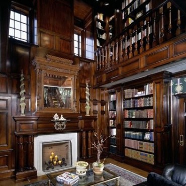
Source: Houzz.com
In the wow-sa category…
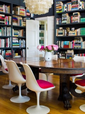
Source : Marcus Design
And more pink! What’s the deal with hot pink in dining rooms? Though I do appreciate how they match the peonies in the pitcher.
So what do you think?
Share this post
You might like...
Category: Home Tours



 Home Tour: A Family Wow of a House!
 Shades of White
 Craftsman Cool
 Classic in Carolina


Marykate Wurster
on January 25, 2013 6:05 pmFun idea. And pink in the dining room – love! But to do something that bold the color has to be bold – so hot pink all the way!
Julie
on January 26, 2013 8:49 amNot quite my cup of tea – too busy for me for my ideal dining room. But if it works for you a great use of typically empty dining room space. Of course I could live with the wow-za room since most of the library is on the second level. 🙂
Jeff
on January 26, 2013 12:22 pmexcellent idea and may try it with one wall
Heidi Farmer
on January 27, 2013 8:13 am@ Julie, that’s funny because I;ve had this idea for a while, but when I saw these photos as examples, I wasn’t sure I was as gung-ho about it. Perhaps the books make everything look too busy/messy? Usually I think of books as relaxing and comfortable. Hmmmm… still thinking.