Wow of a Home
December 6, 2013Home Tour Friday is upon us. And today’s home is stunning. Spectacular. Striking.
And it has several unique features that will wow you. Are you ready?
I’m happy to report we’re traveling to my home state of Michigan. Home of beautiful lakes, warm friendly people, and great ice cream and fudge (I’ve been known to indulge). Today’s home is set on a lake outside of Traverse City, in the northern region of the lower peninsula – yes I know that’s confusing. So here we go…
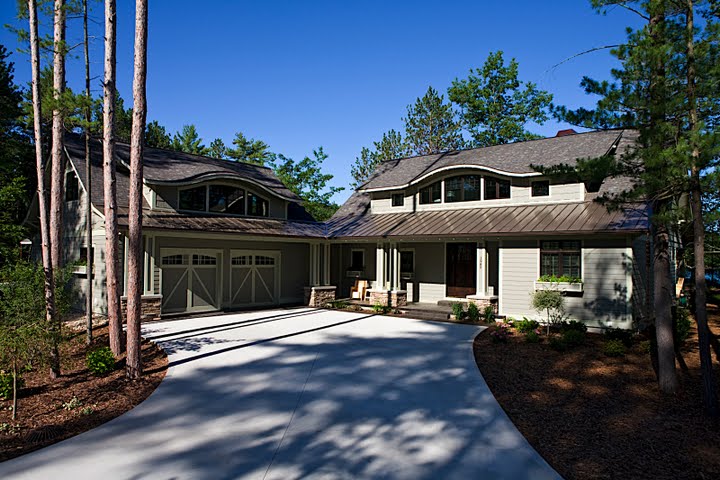
**Oops!** Turns out I had the wrong photo of this house. This is the correct house. The other is the grandparent’s home. No worries, we get to tour that one next Friday.
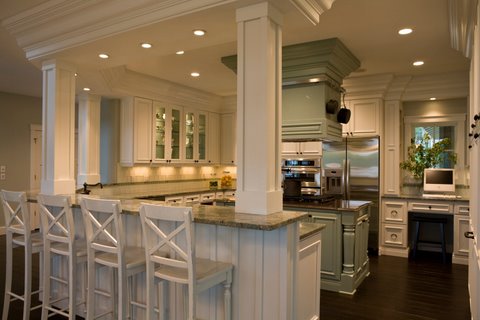
I actually wasn’t sure where to start today. But kitchen it is. And what a kitchen it is!
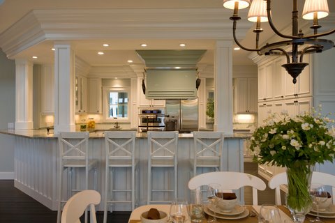
Paneling. Wainscoting. White. Gorgeous.

I know I say this every time, but I would have loved to be there on move-in day. Just for the kitchen though. That’s it.
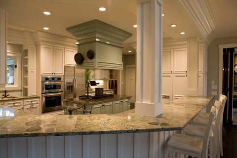
The granite is exquisite and reminds me of Petoskey stones. Love it.
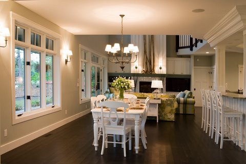
I love that the windows come almost to the floor to drink in all that sunshine and the tremendous view of the lake.
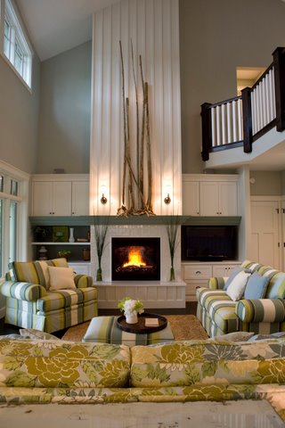
Hello 30-foot ceiling!
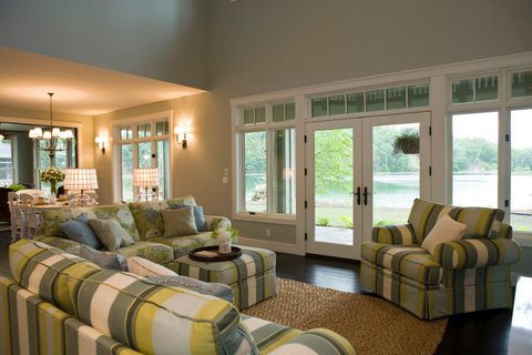
What a view!

I love the openness of this home. No wasted formality on living rooms (you all know how I feel about those).
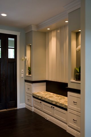
Okay, this is a brilliant idea. Immediately next to the front door and bench and drawers to stow things. I just noticed that large drawer at the very bottom – can that be for shoes? BRILLIANT! I will NEVER, not ever show you the large pile that accumulates next to our front door.
Here’s where you need to prepare yourself:
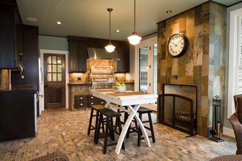
A second kitchen! (As if the first wasn’t enough.)
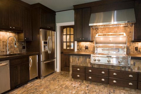
Located directly off the kitchen/eating area, this is the four-season room featuring a built-in grill and fireplace. A Weather Shield Bi-folding door protects the entrance from the kitchen area.
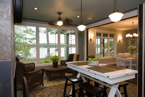
In the summer, the space converts into a screened-in porch. Pretty seriously awesome.

Heading upstairs…
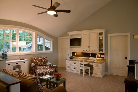
Love this workspace/sitting area at the top of the stairs…
which looks down onto this…

Hoping the adorables are not climbers as mine are!
Now here are the two cutest rooms for the adorables:
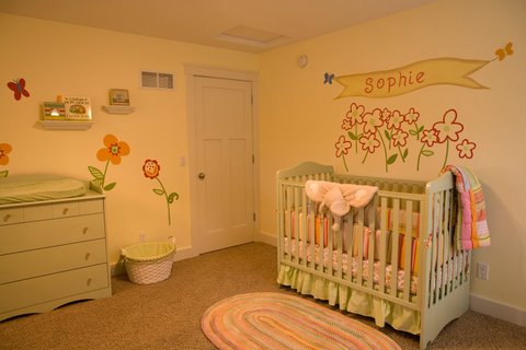
This is sweet Sophie’s darling room.
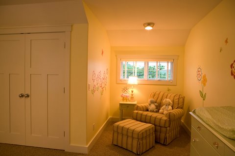
Happy, happy room.
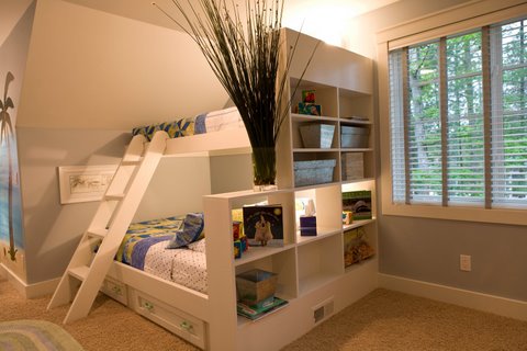
And this is one great room for a toddler boy.
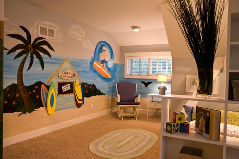
One lucky adorable. Love it.
And back downstairs,
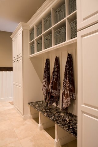
A great mudroom/laundry combo… Why, you are wondering did I save the laundry room for last? Can’t wait for you to see…
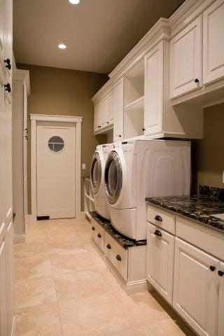
Rock on! Love that these are elevated to save your back. Not to mention that it’s gorgeous. But I’m really stuck on the elevated thing.
So if you are building a house in Northern Michigan, I think you should contact Dean Adams of Bay Area Contracting. He, clearly, is talented.
Partnering on this home were:
Ken Williams, Architect, Design Classic
Shane Inman, Interior Designer, The Inman Company
Old Mission Windows, Traverse City, MI
Many thanks to Courville Imaging for the use of the photographs.
Share this post
You might like...
Category: Home Tours
Tags: home tour fridays, Home Tours |





 Lake Charlevoix Luxe
 Frank Lloyd Wright House Walk!
 Barn Beauty
 Home for the Holidays...


Whitney Trujillo
on September 18, 2009 8:46 amAll I can say is WOW!
Christine
on September 18, 2009 10:50 amThat’s incredible!!!
marla
on September 18, 2009 10:51 amLove this house!!!!
Sarah
on September 18, 2009 12:25 pmOut of control gorgeous!
Julie
on September 19, 2009 7:30 amWhere did you grow up in Michigan? I was in the southwest corner; Niles – just over the border from Indiana.
Nic
on January 28, 2010 5:32 pmPetoskey stone, yes! I was born in Petoskey, spend the first years of my life in Mackinac. Some stunning homes there, by the way, but none that I’d want to move into… like this one…
The “four-season room” and the sitting room at the top of the stairs particularly got me.
Holly hack
on August 19, 2010 7:45 pmStunning
Stephen Woronoff
on August 20, 2010 9:09 amGorgeous, This Took Talant!
Terri
on August 23, 2010 6:39 pmCan he come to Texas please………….
Handyman with a smile
on August 31, 2010 12:15 pmThat’s one classy house!
I like the main kitchen design – clean lines and light colors – just the way my mom had it!
Andrew
on November 1, 2010 1:21 amIt’s not really innovative or stylish- just big. The complications, expense and environmental considerations of heating and cooling a place like this are dire. I would argue that this place is not as dreamy as is suggested- it’s just big. I know that in America bigger=better, but make it solar heated, make it cooled by underground passive heat exchangers, make it a bio-neutral with greenhouses and so on. Instead, it’s just big. This is about as inspiring as a humvee. It’s just big.
karla
on November 1, 2010 1:53 pmi wanna house like that!!! i love it!!
Molly
on November 2, 2010 5:01 amWhy do Americans have such over the top taste in design? This is dreadful!
Heidi Farmer
on November 2, 2010 8:08 amMolly, so sorry you feel that way! I just love this home!!
Maria Cristina
on November 21, 2010 2:31 amWow wow wow! I’ll love to have a house like that!
Carpet Cleaning
on January 5, 2011 1:13 amThe house is okay, but not my favorite. Kind of looks very cookie cutter except for the kitchen stove area (which i dont like, a lot of unused space there) and the laundry room
annabella
on January 6, 2011 8:08 amthe house is lovely- but you should have found a better painter to do the doys room mural.:(
Ashley Lauren
on January 8, 2011 6:55 pmThis flows from one room to the next! It’s like an endless dream that I don’t want to wake up from!
Jennifer Davenport
on January 25, 2011 10:36 pmFabulous! Elegant but not stuffy. Sofia’s room is adorable!
fajas colombianas
on March 11, 2011 10:19 amNo place better than home. sweet, elegant, neat, and best of all, none of those shiny expensive stuff unlike other houses
tiffany
on March 11, 2011 10:42 amJust looks like a show home with absolutely no character, history or soul – sorry not my style/tatse.
Varun
on March 21, 2011 4:34 pmWant some more this.. Very elegant.
Karen
on March 24, 2011 2:53 pmToo much white for me. And not enough character. But a nice house all the same.
Charles Levine
on March 25, 2011 4:46 pmI’m afraid I have to agree with the naysayers. I came upon the page from stumbleupon, which rotates me among design/interior design and architecture sites, and this just doesn’t stand up. It’s pretty, and certainly bespeaks a certain degree of wealth. But there’s no real eye here, just a lot of pretty stuff. Like the house of a doctor who likes nice stuff. “New money luxury” or something. Like others say, no character, no real elegance, no real design. I’d live there of course. But I’d want to move somewhere cool.
friendandfaux
on March 29, 2011 10:59 pmI totally agree with Charles.( Stumble brought me here too). No heart no soul nice place to visit like a good hotel, but not day after day.
Amanda
on April 28, 2011 9:08 pmThis house is a beautiful modern take on Henry Hobson Richardson’s work. I love it. I would personally decorate it differently, but this is pretty close to my dream house.
Jennifer
on October 28, 2012 7:50 amA-maz-ing!!! I just love it all. Seriously, from the flooring to the ceiling! I would love to see a copy of the house plan, if possible, please!
Marykate
on December 6, 2013 10:05 pmI love house tour Fridays. Like really really love them. Okay, the kitchen? amazing!! Such a fun house – full of surprises!
Chani M
on December 9, 2013 11:45 amOmg I love this house!!!!!! I just want to pick it up and move it somewhere warm 🙂
Caitlyn Bell
on August 16, 2014 10:12 amJust Wow!! Such a beautiful design. Love all the pics. Great work!! The exterior is outstanding, and the interior is extremely magnificent I like the colour combinations you have used throughout.